A little article from way back when.. and a Facebook change that we have already been so used to, we forgot that it was ever “new.” Note: These tips apply to that way back when…
3 Tips To Help You Over the Hump

Ok, maybe it is because I like to stir things up a bit. Maybe it is because I like change. Maybe I just like to be contrary or zany for the fun of it all.
However, you cut it, I am embracing the new Facebook Timeline change for Facebook Pages. After all, I was an early adopter of the Facebook Profile Timeline. Then, again, even if I don’t embrace it, what is a person to do? Right? You could protest, but really, do we have the time and energy?
I don’t insist (like I could!) that you like the FB Timeline for Pages as much as I do. Hey, you don’t have to like it at all! But, I can be here for you and offer a couple of tips to help you over the hump, eh? So, let’s look at a couple of things you can tweak on your page while you are getting used to it. Ok?

“What is that da*n thing at the top of my Page?”
The answer to the question of what is at the top of your page depends on whether or not you have “published” your page timeline yet. Ok, hold on, I’m not jumping ahead. Chances are, if this is the first time you have seen it, it is an announcement giving you the chance to preview the changes (that is, the Timeline). You are not forced to choose the Timeline format as of the date of this post, but you will have the Timeline for Pages, according to Facebook, by the end of this month, so you may want to click on “Preview” to check it out (as well as get a context for this post). Your FB Page will not take on the new look until you click “Publish.” So, for now, you can play around.
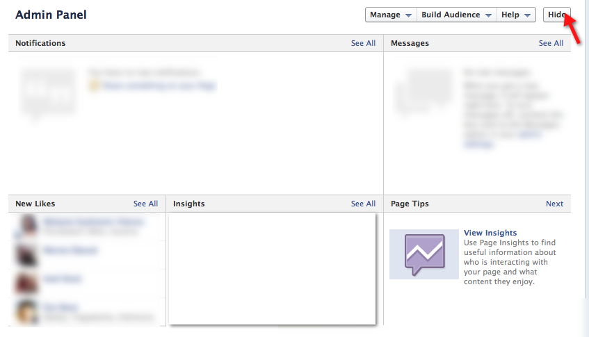
Now, if you are one of those early adopters, like me, you will not see the announcement, but rather the “Admin Panel.” Is it annoying to you? Well…

Tip 1: Admin Panel
The Admin panel is really quite nifty, pulling in all the features into one convenient spot at the top of the page. If you are anything like me, I often times didn’t click on the Admin button because it was inconvenient. In this way, you can leave it open, reminding you to review it now, review it later, or review it often, or, if it annoys you, you can also collapse it. To collapse the panel and view the page in a way that the LIKErs see it, click on the button in the upper right, as shown in the image above, to hide the panel.
Hint: The admin panel has a lot of cool stuff, and even has an option to go back to the “old” admin area, as well as access to ads. So, once you get used to it (including the wonderfully awesome instant insights), it is pretty cool indeed!
Tip 2: The Cover
To change (or insert your first) cover, click on the “Front Cover” pull-down, as shown, below:

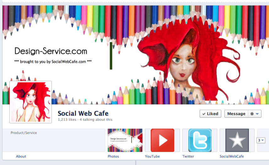
Similar to the Facebook Profile Timelines, there is that little box in the lower left area where the profile pic overlaps the cover. You certainly don’t need to worry about it, and for now, I didn’t accommodate it on the Facebook.com/socialwebcafe page, but you may want to work it into the design of your cover. Let me show you what I did with my Music Facebook Page:
First, I looked at the branding that I had created at my main website @ deborah.info and examined how I wanted to incorporate the design and branding into my FB Page. Here is the header from the main site:

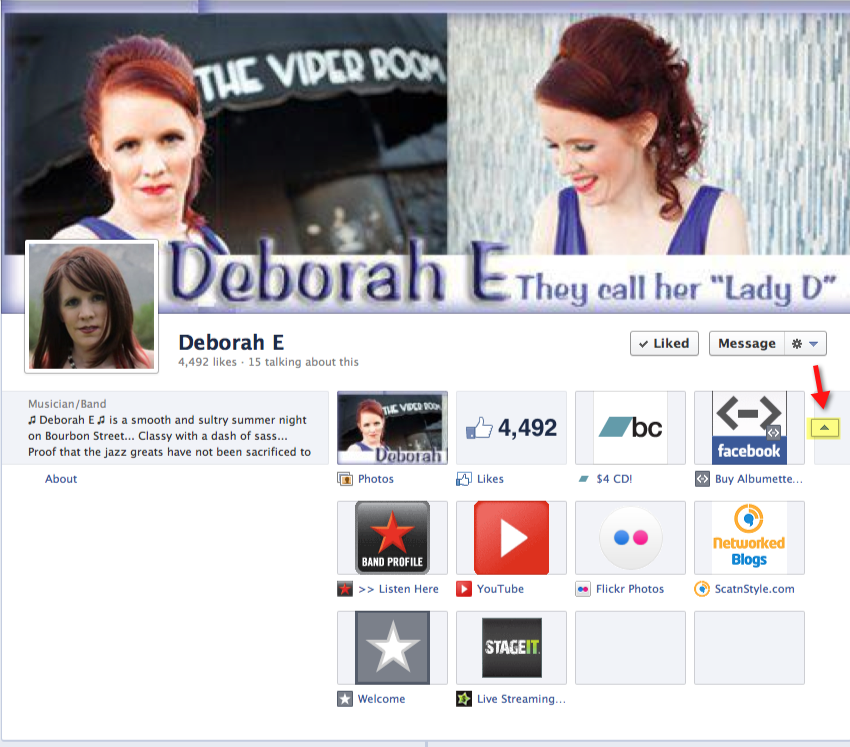
And, here is the cover that I created from that same header by doing some chopping, moving, re-arranging, to make it fit the cover in the Facebook Page *and* allow for the cutout section in the cover:

As you notice, when comparing the two designs, had I *not* done some modifications, the little profile pic would have covered up my name!
Again, you do not need to make these design changes, but I wanted to give you a basic idea, should you desire to do it in the future. 😉
Tip 3: The Apps (a.k.a. “Tabs”)
After the strange, or not so strange, top of the page, you may notice that all those cool apps that you had, that used to show up to the left of your page are gone! Well, not exactly, but they are in a different place.

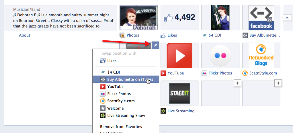
You can move those little icons around, if you like, so that you can control which ones show up on your page. Click on the little arrow to the right (see above picture and red arrow pointing to it).

When you click on it, you have the option to switch that app with another in the navigation area. See pic, above, for example.
There are some buggy issues, like, when clicking on the app, it still has the “old” look, and no streamlined, consistent navigation area. And, it appears some of the apps may have issue with the change, but hey, we are in a transitional state, and besides, I decided to be an early adopter, so I cannot complain!
Final Thought(s)
There are some other cool things you can do with this new Timeline, but will save that for future tips. Gives you a reason to come back, eh?
Comments on this entry are closed.
I love the new FB Timeline. And I really like the restrictions too, because it forces people to get creative and I’ve had a blast checking out everyone’s new header image.
I’m still working on my image, I’m not sure if it’ll stay or go, but I’m having a blast making my pages work for me 🙂
Hi Kimberly,
Absolutely. It is all in the fun 🙂 I just made another image, and like you, not sure about it, but you don’t know unless you try!
-Deborah
Its really very nice new Facebook timeline. Its amazing because we want to change cover and change the image. thanks for sharing.
Yes, I get a kick out of the new timeline. I keep talking about changing the cover… 😉 Thanks, Song Lyrics.
The new Facebook Timeline is actually quite nice. We need to change the image of the cover and change its awesome because. Thanks for sharing.
I do want to change my facebook timeline…!
The New FB Timeline is a great stuff & I really love every piece of it.
Cheers..
The new Facebook Timeline is actually quite nice. We need to change the image of the cover and change it’s awesome because. Thanks for sharing.
Yes, Facebook has had some interesting changes throughout the years. For the most part, I can see the value in those changes.
Thankyou. Very much this helped me in increasing likes on my facebook page.
Good to hear, Abhishek. May you continue in your success!
Wow,
what an article.I really enjoy it. Really FB is one of the best social media site that I ever seen.
Yes, I like Facebook as well 🙂
Nice post buddy thanks for sharing with us.
Thanks for the feedback. Though, I’m not generally referenced as “buddy.” I think of that for a male gender and I am female :). Please feel free to refrain from referencing me as “buddy.” You can say, “friend” or something of the female gender, but I prefer not to be referred to in a sense that sounds male. Thanks!
It’s really very nice new Facebook timeline. It’s amazing because we want to change the cover and change the image. thanks for sharing
perfect article for new facebook line. I really felt awesome visiting this site.
Great! Very much this helped me in increasing likes on my facebook page. Thanks a lot for sharing this article. Keep it up.
Thanks new Facebook is very good .
Facebook New Update is coming soon. Now you can Find a new Button on any article shared on Facebook News Feed by which you can decide which one you want to read, share and trust.
Nice article and I too like facebook timelime for pages.
Thanks It helped me in increasing likes on my facebook page.
cool, very much helpful for me, helped in improving my facebook page
so, keep up the good work
than you
aditya
Glad you found it helpful, Aditya! Thank you.
Hey,
This is a very informative article. Facebook timeline for pages is a very useful feature. I like it very much. Thanks for sharing this article.
Have a nice day ahead.
You’re welcome. Happy to write it for you to read on the site here. Thanks.